There's nothing like a good birthday party, especially when you get to take home balloons.
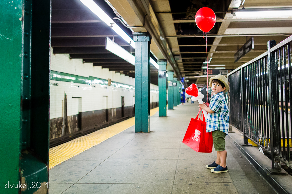
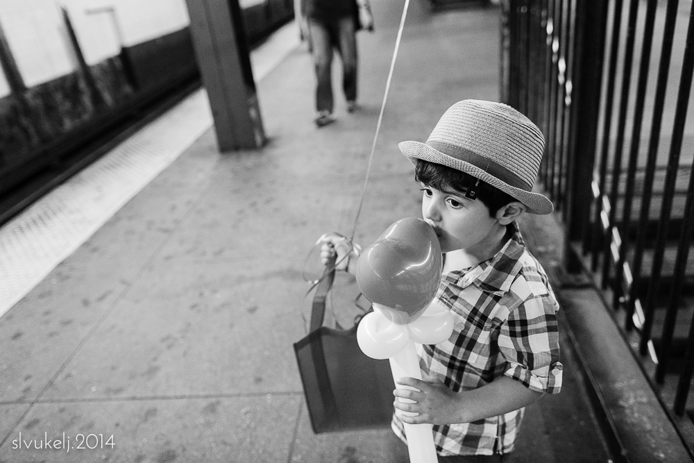
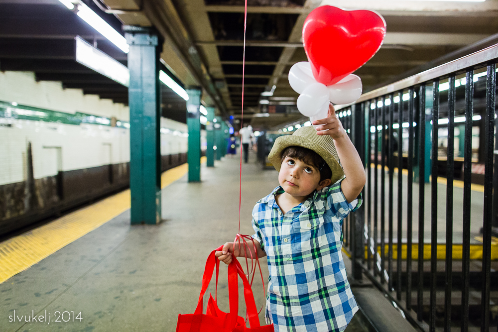
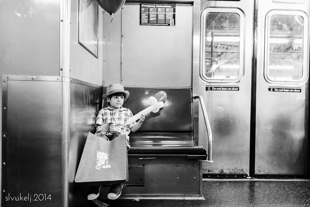
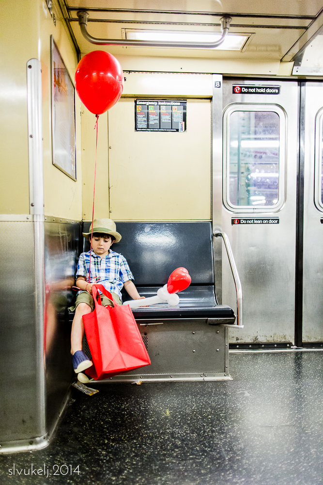
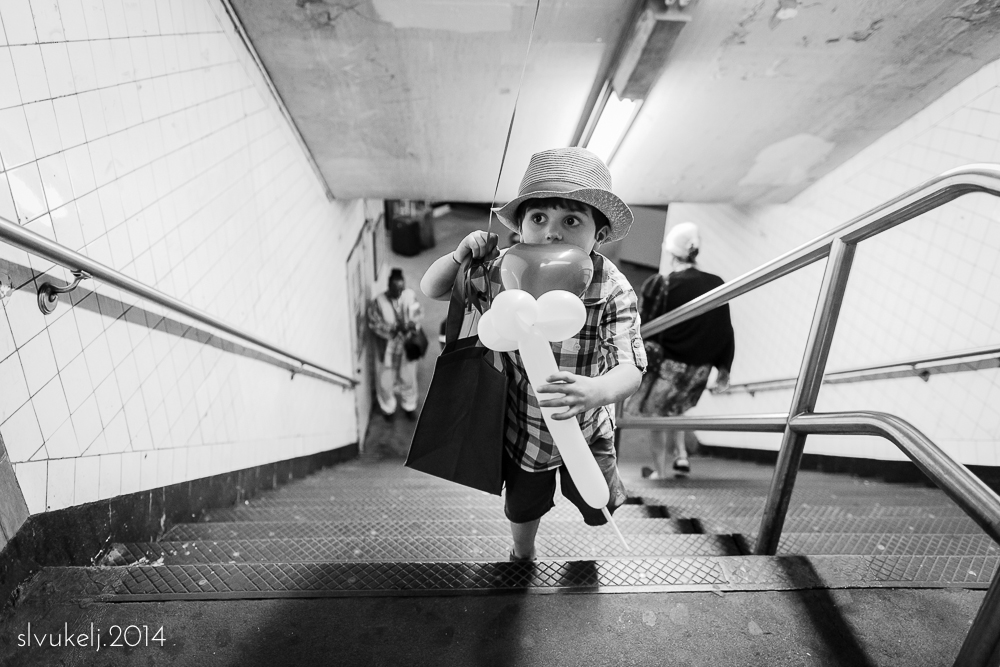
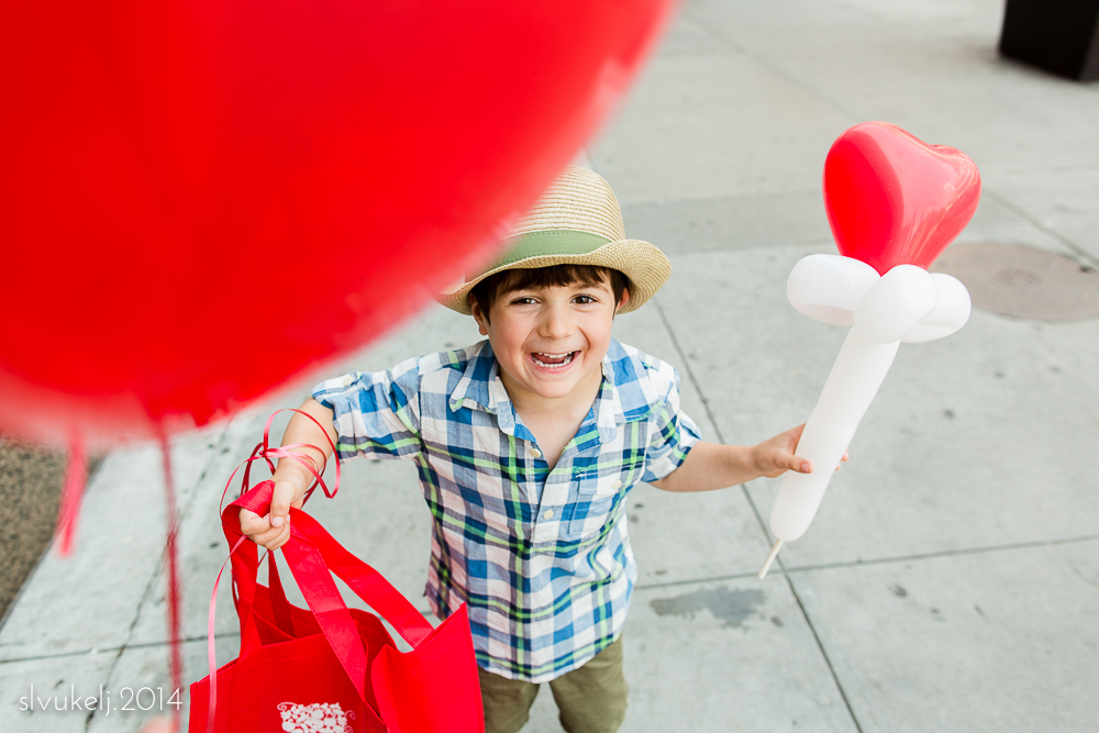
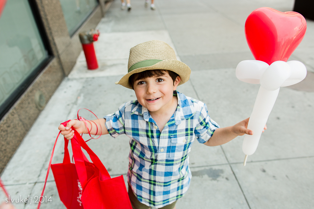
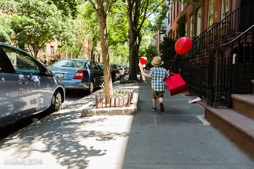
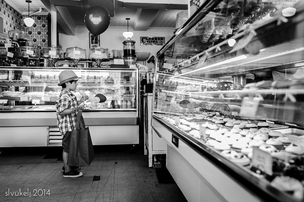
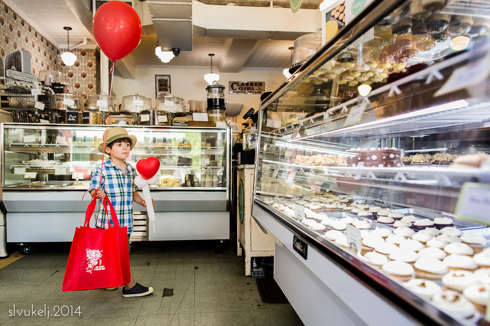
There's nothing like a good birthday party, especially when you get to take home balloons.
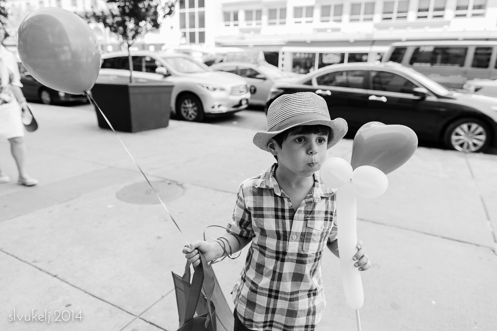
I have to admit, I miss getting out there with my camera. These days, with a new baby and a kid on summer vacation and other things keeping us busy, I am finding it hard to shoot for myself. My goal is to make a return to street photography more of a priority in the coming months but in the meantime, I am going to cut myself some slack and try to ease back into the swing of things by focusing on my small boy/big city project instead. So, if you come across a random woman running around the streets of New York cajoling a four year old to try and look less miserable doing things he normally loves to do in exchange for some form of sugar, while also attempting not to knock the baby tied to her chest senseless with her camera...do say hello.
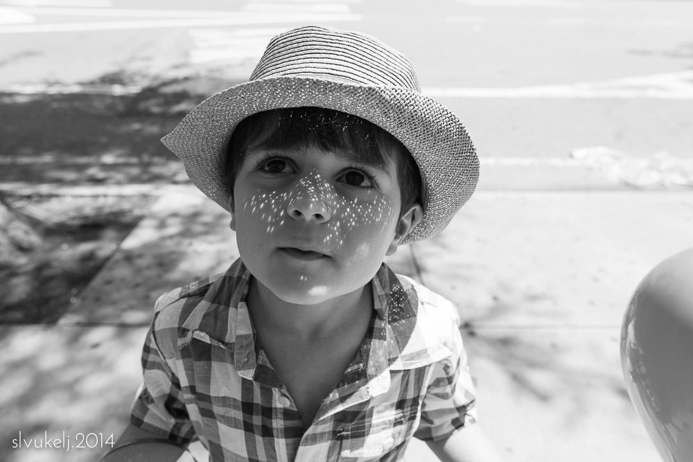
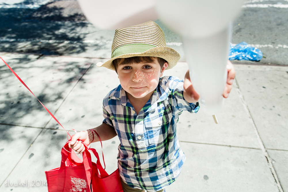
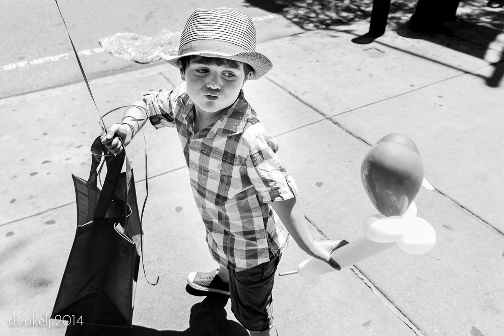
This week in our portraiture study, our compositions are built around half or three-quarter body shots. Unlike the traditional headshot, the partial-body composition often also includes more contextual surroundings and is a fundamental compositional basis for many classical artists. I attempted some different angles on my happy camper on his first day of summer break and found the partial-body shots angled from above (and below) to be my favorites.
Please pop over to Who We Become to see what else we all found above the belt this week.
It's a new month, which means we Photo 52.2 participants have a new topic. During June, our focus within the frame will be on compositional methods in traditional portraiture. For our first week, we are experimenting with the classic headshot. A headshot generally includes just the head and shoulders in the frame. While neither of these would work well for a business profile, they meet the "head and shoulders" criteria and are images of two (and a bit) of my very favorite heads, so I think they'll do nicely.
Continue over to Who We Become and check out the cuties and beauties featured in headshot week!
I am ready to say goodbye to May. It should have been a beautiful month, but unexpected storms blew in.
Please continue around the circle to see the one shot that spoke to my dear friends this month, starting with Jessica Remus.
It's Photographer's Choice in our final week of color study and we are finding creative ways to put what we've learned to use. My images are not particularly colorful, but shot with our lessons in mind. The first is a nod to analogous color schemes, with hints of green and blue, and the second draws on the complementary tones of red and green.
Please head over to Who We Become and see how my fellow participants rounded out the month.
This week in our color study, we are investigating achromatic photography. An achromatic image is one that is without color. This can be a black and white image, or a color image shot composed of only greyscale tones. I attempted to find the latter. Graffiti, pavement, my favorite mug and a black granite countertop...it was fun to try and locate spots lacking in color.
Please stop by Who We Become to see everyone's interpretations - our achromatic efforts make for a harmonious collage, yet stand in stark contrast to the bright imagery posted in recent weeks.
Happy Mother's Day and welcome to week 32 of P52.2 Framed. We are in our second week of color study - this time using complimentary colors (colors across from each other on the color wheel) as the foundation of our images.
I was searching all over for useable color combinations this week and at the eleventh hour I hit upon some blue/yellow combinations. First, some bubbly at brunch and then some fun graffiti.
Please check out what the rest of the group has found this week over at our collaborative site, Who We Become!
It's a new month and spring has finally arrived for most of us. With the improving weather, we are hoping to brighten things up a bit by embarking on a color study. For our first week's assignment, we focused on creating images with analogous colors (colors adjacent to each other on the color wheel, such as the warm tones in my image) or with a monochromatic color scheme - varying tones of the same underlying color or the more traditional black and white.
I admit, this shot was not taken with our assignment in mind, but with the beautiful red and yellow flowers, her orange shirt and her gorgeous smile, I had no choice but to post this image of my dear, dear friend and fellow P52 participant, Kami Chaudhery.
Please click on over to Who We Become to see what everyone is up to as we say hello to the month of May!
So far, 2014 has proven to be an action-packed year for all of us in the One circle. Babies, weddings, school, big moves...we are not resting on our laurels. As April comes to a close, I know I'm not the only one who is struggling to find time behind the camera, but find time we do - if only for the most important things. Like a one-month "birthday"!
Please take a moment to pop around our small circle and see what my other amazing friends have found noteworthy this month, starting with the wonderfully talented Sarah. She has been in the throes of hosting a wedding, so perhaps we'll see some of the fun chaos, or maybe a peaceful moment in between...
It is week 30 for P52.2 Framed, and our final week on utilizing tonality as a compositional element. After three weeks of using lighting techniques to create mood, this week we turn to split tone color. Split toning adds a color tint to the highlights and/or shadows of an image, while leaving the mid-tones alone. It can be used in black and white as well as color photographs, as demonstrated below. Split tones can have a significant impact on the overall feeling of an image and is a fun, creative technique to employ once in a while.
Please head over to Who We Become to see our collective work this week - it's a fun and colorful collage!
As shot
Pink highlights, blue shadows
Standard black & white
Black & white with red highlights, green shadows
Nailing down definitions for our month of tonality has proven tricky - especially this week as we turn to mid-key. While we know it when we see it, it is a bit hard to describe. My take: a pleasing, mid-range palate that lacks the overall brightness of high key and the drama and shadows of low key but that isn't so uniform as to obscure the subject or wash out the image. I think mid-key can be gorgeous, with rich jewel tones and textures, even though I prefer them in color.
My image this week doesn't have an obvious subject, but I played around in the bright sun and liked the feel of this out of focus shot of Madison Square Park. To me, it captures the urban environment and the impression of warmer weather with colors more than form. However, my mother mentioned that she "not a fan" of blurry images so perhaps it is not for everyone. :)
Please head over to Who We Become to see everyone's work this week!
This week on P52.2 Framed, we continue to use lighting techniques to add mood to our compositions. Low key lighting emphasizes darks and shadows, giving a dramatic or contemplative feel to an image. While the technique is a favorite of mine and makes for beautiful shots, this week's exercise demonstrates how much more of an impact low key lighting can have when the mood of the subject matches the tonality of the image.
And yes, there was also a hair cut.
Please pop over to Who We Become to see everyone's work this week!
Merriam-Webster defines "composition" as "the way in which something is put together or arranged : the combination of parts or elements that make up something."
This month over at Who We Become, we are taking a step back from the more physical elements of our compositional study and focusing on other elements in the frame: creating mood. For week one, we are using high key lighting techniques to set the scene.
Examples of a high key technique can often be found in commercial work - bright images that have few mid-tones and even fewer shadows. Photographers may use this technique to create a sense of cheer or playfulness, or evoke feelings of youth. For my shots below, I think the brighter background and haziness of the light results in a dreamy effect and keeps the focus on my sweet subject enjoying a taste of Spring sunshine.
Please click over to Who We Become to see everyone's images this week - the bright palate is striking.
March was a big month, and this time around I can't help but break the One shot rule. It's our first month as a family of four and I just can't bring myself to leave either kid out. The big guy is climbing the walls while the little lady is just starting to wake up.
Please take a spin around our One circle to see what has touched the hearts of my dear friends this month, starting with Jessica Remus, who deserves much respect after riding out a rough Chicago winter.
While I haven't made it back to the streets yet, I have made it to the playground where there are signs of Spring on the horizon. Tentative (and wet) but I have hope.
Those of us over at Who We Become are now at our halfway point in our second 52 week photography project. Please click on over to see what everyone chose during their "free" week and take a peek around. We've updated the site to include images and information on our first year's Project Light as well as our composition-focused posts from this year.
This week on P52.2, we are turning our attention to conceptual contrast. Big and small, old and new...there are some amazingly creative examples over at Who We Become. In our house, "old" and new seemed the most appropriate as we welcomed the newest member of our family. Not enough words in the world to describe how much I love these.
As March inches onwards, over at P52.2 Framed we have transitioned from featuring patterns in our compositions, to using various concepts of contrast as the underpinnings to our images. This week, we are looking at traditional contrast - light versus dark.
On a family outing to Brooklyn yesterday, I had fun searching for the right light to work with for this week's assignment.
It's a beautiful and dramatic collection of shots over on Who We Become - please click on through to check it out.
Jane's Carousel
Streets of DUMBO
Bargemusic
Moon over Brooklyn