Blog

Photo 52.2: Framed {Week 52}

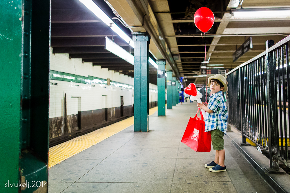
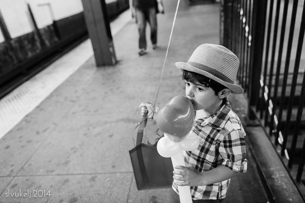
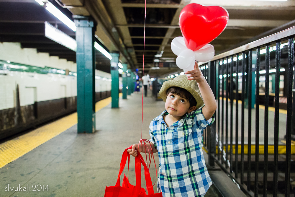
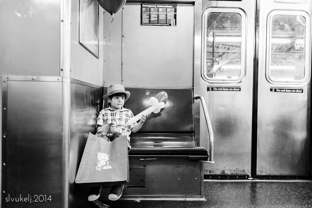
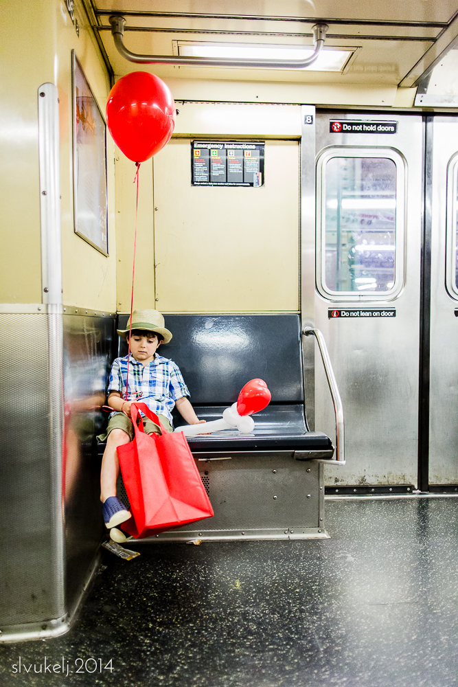
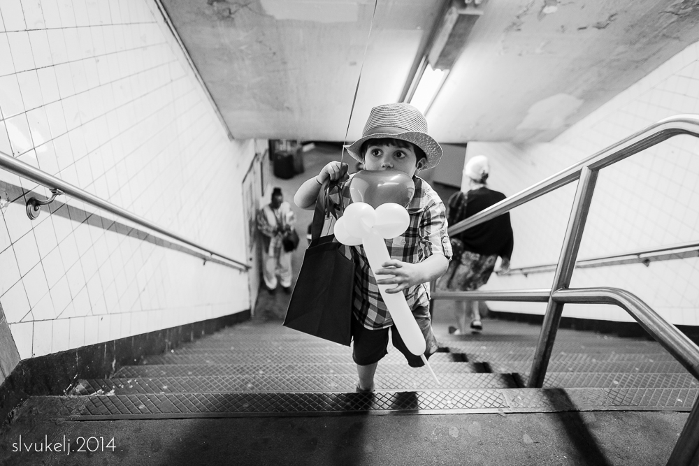
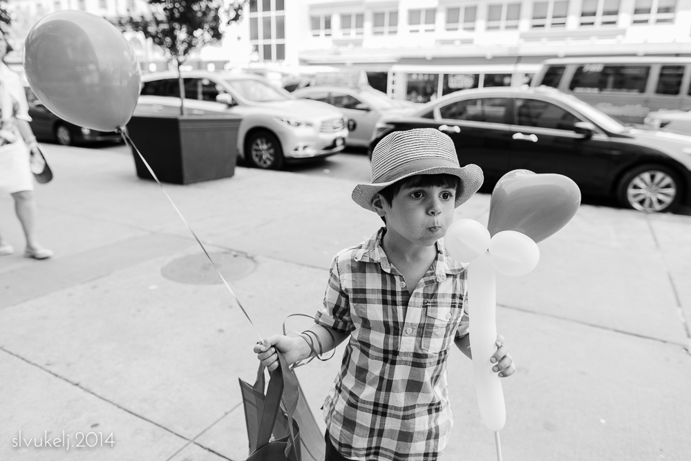
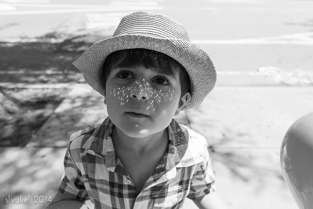
And...scene! Another year of shooting, another year of collaborating with friends, another year of photography. Participants in Photo 52.2: Framed are closing out the project with a personal favorite from the year. Mine is a new shot and is not a favorite of the year, or even the week, but simply a favorite image I took today. It is a reminder to enjoy the city I live in; the city I love. 

We have some new ideas over at Who We Become and we hope to get them up and running in the next month or two. It is exciting to embark on a continued collaboration with my talented and generous friends - especially one that feels a bit different from our more technical goals of the past two years - and we hope we can convince you to come along for the ride.

Who We Become - week 52.

Photo 52.2: Framed {Week 49} - Multiple Exposures

Only four weeks left of Photo 52.2: Framed. We've nearly made it through another year! After a bit of a breather, those of us participating over at Who We Become hope to come back with a new and different project for the coming year, so please stay tuned.

September is here and we're closing out the year with a few creativity exercises. This week is multiple exposure. I hope to learn how to properly do this with film but digitally these images can be created in-camera, if your camera body has the technology, or in Photoshop. Since I have yet to learn how to use Photoshop, in-camera it was for me! Figuring out how to make a dynamic composition will take some time to master, but I had fun creating these cityscapes - a little skyline juxtaposed with our newly minted bike-rider in action.

Please head over to Who We Become and see the other fun my friends have had this week - the sneak peek I had of one of the images blew me away and I can't wait to see the rest!

LG2A2900001.jpg

Photo 52.2: Framed {Week 46}

Our month of traditional compositional technical study continues. This week, it's the golden triangle. If you'd like to geek out on the math, check out some info on the golden ratio to see the fundamentals of the concept. 

However, to offer a basic explanation, we are using the same aesthetic notions that we did with the rule of thirds, but this time, our goal is to create diagonal lines in our images to form isosceles triangles. Points of interest in the image should lie along diagonals and at the intersecting points of the triangles in order to create a dynamic image and lead the eye around the frame. Creating one triangle is relatively simple. Creating two is more of a challenge.

I am having a terrible time articulating how this works so I have also included a screen shot of the Golden Triangle overlay offered as a cropping tool in Lightroom. The lines are faint, but in this image, the angles created by the table, my son's gaze and reach, and my father's bent arm all form triangles within this image, giving it a dynamic flow. 

In the second image, there is a clear triangle created by the road and building leading to the city skyline, but there isn't really a second triangle on the right. WIthout that second ancillary visual diagonal, it lacks the complexity of my first shot. 

Head over to Who We Become to see the angles we found this week. 

Photo 52.2: Framed {Week 44}

August! Nearing the end of summer and the end of our P52. At this juncture in our year-long study of compositional techniques, we bring it back to basics, starting with the Rule of Thirds. Simply put, a photograph is generally (generally!) considered more pleasing to the eye if the frame is divided into a grid with nine equal sections and the subject of the image falls on one of the intersection points. Or with landscapes, the horizon falls on the upper or lower third of the frame rather than in the center. 

This week, my guy and I headed out for a photo walk and took a few pictures...in this case, of each other. In my image, his face is on the intersection point at the upper left side of the frame. In his image, while I don't really fall on any intersecting points, the stroller and I occupy the right two thirds of the frame. Fun ideas to work on as he gets started.

Please head over to Who We Become and check out our collaborative page this week!

One {June 2014}

June! And just like that, we are halfway through the year. This month meant the beginning of summer, the end of pre-school for my small guy and a long-awaited visit from the amazing women of this One circle!

I have to admit, I had more fun watching them take in the city than trying to document it myself, but I did get a shot or two. I liked this one - not because it features any of my special people, but because it is of one man, finding an audience for his art. 

Please head out to Colorado to see what my incredible friend Sarah has captured this month and continue around our little circle!

P52.2: Framed {week 37}

This week over at Who We Become, we continue our exercise in portraiture - this week with full body portraits. Full body portraits are personal favorites of mine because of the amount of context these shots often include. I found my fabulous subjects at a summer street fair and while they would look awesome anywhere, I like how the hustle and bustle of the environment, as well as my tight shooting quarters, are evident.

Please head over to Who We Become to see everyone's work this week!

P52.2 Framed {Week 34} - Color Study 4

It's Photographer's Choice in our final week of color study and we are finding creative ways to put what we've learned to use. My images are not particularly colorful, but shot with our lessons in mind. The first is a nod to analogous color schemes, with hints of green and blue, and the second draws on the complementary tones of red and green. 

Please head over to Who We Become and see how my fellow participants rounded out the month. 


P52.2 Framed {Week 33} - Color Study 3

This week in our color study, we are investigating achromatic photography. An achromatic image is one that is without color. This can be a black and white image, or a color image shot composed of only greyscale tones. I attempted to find the latter. Graffiti, pavement, my favorite mug and a black granite countertop...it was fun to try and locate spots lacking in color. 

Please stop by Who We Become to see everyone's interpretations - our achromatic efforts make for a harmonious collage, yet stand in stark contrast to the bright imagery posted in recent weeks. 

P52.2 Framed {Week 32} - Color Study 2

Happy Mother's Day and welcome to week 32 of P52.2 Framed. We are in our second week of color study - this time using complimentary colors (colors across from each other on the color wheel) as the foundation of our images. 

I was searching all over for useable color combinations this week and at the eleventh hour I hit upon some blue/yellow combinations. First, some bubbly at brunch and then some fun graffiti. 

Please check out what the rest of the group has found this week over at our collaborative site, Who We Become

Photo 52.2: Framed {Week 30} - Split Tone

It is week 30 for P52.2 Framed, and our final week on utilizing tonality as a compositional element. After three weeks of using lighting techniques to create mood, this week we turn to split tone color. Split toning adds a color tint to the highlights and/or shadows of an image, while leaving the mid-tones alone. It can be used in black and white as well as color photographs, as demonstrated below. Split tones can have a significant impact on the overall feeling of an image and is a fun, creative technique to employ once in a while. 

Please head over to Who We Become to see our collective work this week - it's a fun and colorful collage!

As shot

Pink highlights, blue shadows

Standard black & white

Black & white with red highlights, green shadows

p52.2 Framed {Week 29} - Mid Key

Nailing down definitions for our month of tonality has proven tricky - especially this week as we turn to mid-key. While we know it when we see it, it is a bit hard to describe. My take: a pleasing, mid-range palate that lacks the overall brightness of high key and the drama and shadows of low key but that isn't so uniform as to obscure the subject or wash out the image. I think mid-key can be gorgeous, with rich jewel tones and textures, even though I prefer them in color.

My image this week doesn't have an obvious subject, but I played around in the bright sun and liked the feel of this out of focus shot of Madison Square Park.  To me, it captures the urban environment and the impression of warmer weather with colors more than form. However, my mother mentioned that she "not a fan" of blurry images so perhaps it is not for everyone.  :)

Please head over to Who We Become to see everyone's work this week!